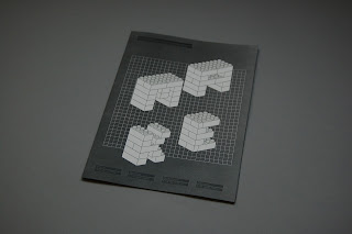
Further development of the booklet - developed the front cover with a few minor adjustments, mainly with the alignments of the images and the type/layout. I decided to print these out in full colour, with a set of 4 different cover designs, that would each capitalise on a specific colour that associates to the LEGO bricks.
Developments for the front covers - experimented with a few minor adjustments, one of them was the variation of the LOGO being black/white or inverted etc.
A copy of each cover, each has the same cover but different colour variations based on the LEGO brick colours. I think they work really well together, the layout of the text seems to work well and I like the logo that's formed out of LEGO bricks, however I think I could push this a bit more and make individual designs for each colour instead of having the same one.
In terms of the stock, I really want to experiment with something that resenbles the plastic / tactile quality of LEGO bricks, so might venture into printing on acrylic or gloss stock.
Subscribe to:
Post Comments (Atom)


No comments:
Post a Comment