This year proved to be a challenge from the start. Having to write 10 initial briefs and a statement of intent to define who we are as designers was a struggle to begin with. As someone who finds it difficult to make decisions and hate's to make any commitments, this process took much longer than expected, I found it quite difficult to put things down to define who am as a designer especially as I felt that I wanted to pretty much do everything. The process of prioritising the things I wanted to focus on really helped clarify what I wanted to do a lot more, helping me define the types of briefs I wanted to work and what I aimed to achieve from this module.
My main focus for this module was to really explore and develop both my design and practical skills as a designer and produce some high quality work that would contribute towards my portfolio. I really wanted to experiment a bit more with print processes whilst developing my type and layout abilities, which I felt my selection of briefs really worked well towards. When it actually came down to the design practice, I did struggle a bit to make a start in the beginning. I managed to keep up with my schedule and produced the work for the crits on time, but wasn't entirely satisfied with the work I had produced. For the majority of the time I was undecided on several different design directions which stalled the process a bit and left myself in a negative mood to move onto other briefs. Inevitably, this left me a few days behind from an early stage, I felt that my work wasn't developing how I wanted to so decided to pick up the newsletter brief to allow myself to work on fresh material while I postponed the other one for a few days. I managed to complete the newsletter in a day and was selected for the final 3 to be reviewed, which gave me some confidence back. At this point I realised that I felt more comfortable working on subject matters that I did not select myself, which made me have second thoughts on my other briefs.
Moving on, I continued to work on my briefs with my doubts about the subject matters that I had picked. Some of the more successful briefs I worked on were the Dimsum and Ocon briefs, both were towards the end of the module. Due to the pressure of getting things completed, I didn't have as much time as I had planned to explore as many different routes as I had wanted. My design practice and the pace that I was working on changed midway through the module due to the time I had planned myself. It was comparable to the pace that I was working at during my placements over the summer, simply developing initial ideas within a day and moving on quite quickly to resolve certain briefs. This wasn't the ideal design process that I wanted to work for, but possibly the ones that I had produced the strongest work out of, which challenged my work ethics and preconception on how I should work.
My main weaknesses of this brief were probably the project management side of things, it was definitely a challenge to juggle several briefs at the same time, especially as I was also tempted to revise past briefs once I had resolved them. I aimed to work on 6-7 briefs for this module, these were a selection of long and short briefs with the intention to pick up a few live ones aswell so that I would have a variety of live, commercial and more culturally driven work to go towards my portfolio. Unfortunately, due to the poor judgement on durations for each brief, I was unable to pick up the competition briefs that I aimed to work on. I found myself constantly putting dates back due to printing and bad timing with events happening during this period, which didn't help, eventually leaving little time to start a further brief. In the end I decided to spend the time revising existing briefs rather than making a start to another small project.
The whole module has been a massive challenge for me as a designer, it really gave me taste of potentially what it would be like to become a freelance graphic designer minus all the admin jobs. For the next module and towards the next few months, I'd aim to really stick to my action plans and make more realistic schedules, considering things like printing time etc. Although I did enjoy the module, I was not satisfied with the quality of work I had produced. Looking back, I don't think the briefs I had written were particularly strong to begin with, I felt that my resolutions were viable design solutions for each brief, but lacked the flare that I was looking for in my work. In the next few weeks and coming up towards my FMP, I will aim to discuss with other professionals in regards to getting some advice on writing briefs that I would like to work on myself. I will also be looking out for more live briefs that I could engage in some form of a dialogue with, which I believe would add to my professional and design practice.
Wednesday, 15 December 2010
Tuesday, 14 December 2010
Monday, 13 December 2010
Wednesday, 1 December 2010
iPhone app final interface
Final design direction for the iphone / iphone alternative digital devices of the dimsum app. The visuals hopefully explain the interface and interactive element of the app and how people would navigate around it. The visual aspect of it implements the infographic icons and details as shown throughout the printed materials, which keep the whole project quite consistent. I had to however adjust the type and layout details such as point size for digital devices, arrangement of icons and text aswell as considering the arrangement of the information and how one page would change to another.
Iphone/ ipad app Home screen
Development for the homescreen and design direction for the iphone/ipad and equivalent digital devices. The designs needed to follow the same design direction of the printed materials but with more consideration to how it would function on these devices. I kept with the same shapes that make the inforgraphics for the poster as the main focus of some of these designs, but applying them with a bit more consideration rather than just pasting the printed materials onto an iphone platform.
Open publication - Free publishing - More iphone
These are the 4 relatively different design directions that I feel are the strongest in terms of the design direction and how they flow with the printed outcomes.


These are the 4 relatively different design directions that I feel are the strongest in terms of the design direction and how they flow with the printed outcomes.


Dimsum Booklet Final
The front & back design for the final dimsum booket before it is folded. This will be printed in full process colours on A2 matte stock.
Iphone interface development
ABOUT
Development of the [About] page, which details the apps main function and a background information about the subject of the app.
Final About interface
 LIST VIEW
Development of the list view of dimsum dishes, with a brief description. Users will be able to scroll down for further dishes, press the grid view to access the gridded view of the dimsum dishes or select a dish which would direct them to a full screen/details for that dish.


GRID VIEW
Development of the gridded interface of the infographics. Aswell as having a list view of the dimsum dishes, the user would also get the option to change to a grid view, which prioritises the use of the infographics.


Development of the [About] page, which details the apps main function and a background information about the subject of the app.
Final About interface

Development of the list view of dimsum dishes, with a brief description. Users will be able to scroll down for further dishes, press the grid view to access the gridded view of the dimsum dishes or select a dish which would direct them to a full screen/details for that dish.


GRID VIEW
Development of the gridded interface of the infographics. Aswell as having a list view of the dimsum dishes, the user would also get the option to change to a grid view, which prioritises the use of the infographics.

SELECTED PAGE
Development of the individual pages for each dish, showing a more detailed breakdown of the information.


Dimsum iphone app icons
Icons for the iphone app for the home screen; a small detail but something that had to be considered still. I didn't want to design anything completely new as this would just sway from the existing materials. Instead I experimented a bit more with existing elements of the designs that I had already worked on, but applying it into this tiled space. The icon itself is just about 10mmx10mm in size so didnt want anything too complicated, such as having a photo; not only will this look quite disastrous, but also quite different from the current materials as I focused more on type and simple shapes, therefore that was the general direction for this aswell.
Eventually I decided to use the last of the 1st row, it's clean, simple and stands out due to it's black border around the circle which almost resembles a plate. I found some of the other way too complicated especially for such a small scale.

Eventually I decided to use the last of the 1st row, it's clean, simple and stands out due to it's black border around the circle which almost resembles a plate. I found some of the other way too complicated especially for such a small scale.
Tuesday, 30 November 2010
Dimsum booklet amendments
A few amendments to make before printing the final outcomes for this tomorrow, these mainly include subtle adjustments with margins and type treatments, I think the overall design for the poster side seems to work alright. On the other hand, I'm not completely happy with the booklet side of it, I don't really think the layout works when folded and the columns just don't sit very well within the format. In comparison to the poster side of the outcome, the booklet seems a bit separated from it, the type seems overly big and the sections don't flow through very well. I also think the copy could be reduced in size from 10 point to 8point and possibly experimenting with a tighter leading specification.
The back cover of the booklet is currently empty, as I wasn't sure whether to place the key there or as part of the poster, but after getting it printed, I think it would be suitable to get it printed on the back of the booklet as this directly links with the front cover, whilst keeping the poster side of it quite bold and data heavy.


Reworked on some more spreads development as there were some major flaws with the printed mockup no.2. Made a few adjustments with the margins in particular, which refines the overall layout when viewed at as a spreads. I found the main issue with the previous layout was that it seemed too separate from the poster side, the type was oversized, which dominated the whole page too much, so resized it. I also found that the hierarchy and reading order of the booklet wasn't efficient enough therefore made a whole change with the overall layout of the titles and copy, instead dedicating each page to a single section.
Development on the front cover
The feedback received from other people found that the front cover was too busy and was constantly drawn to the solid shapes rather than the name of the booklet. I made quite a few adjustments to the overall design for the cover, but keeping with the concept of dissecting the infographics. After developing a few variations, I've ended up going back to the origin design, but making some very subtle changes, these include making everyone on the front cover apart from the title 80% opacity, this hopefully makes the title of the booklet the main focus again as it's the only solid black. The key for the poster has been applied to the back cover, which I feel works quite well, allowing the poster side of it to be a bit more spacious and focused on the infographic diagrams.
Thursday, 25 November 2010

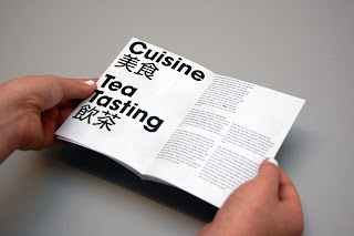
Dimsum booklet mock up 02
An almost complete mock up of the Dimsum booklet in it's functional format, intended stock and size. This was printed in A2 on the 130gsm matte in full colour, which folds into an A5 booklet containing 3 spreads and a fold out poster to reveal the list of dimsum dishes in it's infographics approach.
I wanted a final check with the measurements that I have made and get it actually printed to scale to test the readability and the overall feel of the final product. From this mockup, it's quite evident that there are a few things that needs revising; the cover looks much better than the previous one, it sits more comfortably on the page and definitely makes a better impact when printed in full scale + colour. It's relatively simple, but the layout considerations are evident it it, it's format approach gives a professional feel to the booklet while the spacious layout gives it a relaxed and fun feel. In terms of the spreads, the margins between each spread needs to be increased or atleast adjust the type on it to make things sit a sit more comfortably. I think the copy looks ok, the direction of having separate blocks of text for each section on the same page works alright, but needs adjustments, definitely feel that the headers for each spread needs to be changed; either making it smaller or rethinking the layout of it entirely.
I'm quite pleased with how the colours and print quality has turned out for the side of the booklet, I think the spreads and booklet side of things work rather well together, I do however need to sort out the key for the poster and where that's going to be going. But other than these minor issues, I think a few more hours on adjusting it should lead to a final print very soon!


Tuesday, 23 November 2010
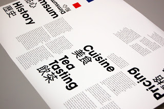
Dimsum Booklet Mock ups
1st mockup printed half the scale of intended on pretty standard 140gsm stock. This was made simply to test out how well the design direction works when printed out and also to test the folding method and whether I needed to make any adjustments to the margins etc.

From the first spreads already, it's evident that the margins are way too small, the type's literally on the verge of falling out of the edge of the pages, which makes it quite uncomfortable to read and look at to be honest. I did want it to have a small margin but because they're so small and inconsistent now, it just looks incomplete. The type on the other hand sits quite nicely, I like the size of the columns just from looking at the overall layout but will have to get it printed out in full scale to be able to check whether it's the right specification.


The fold of the booklet seems to work quite well with this, hiding the poster content inside whilst providing enough space for a few spreads.


2nd mockup printed to scale on satin stock in full colour, it wasn't the ideal stock I wanted to print on but simply did for the sake of checking the type and size of everything in full scale. There are quite a few type asjustments that I want to make on this, mainly on the order of the type, hierarchy of things aswell as the point size and leading of the general copy. The typefaces are inconsistent aswell so will need to ensure that I double check and round things off. ITC Avante Gard will be used as the headers and type on the poster throughout, whereas Times New Roman Italic will be used across the booklet side of it to compliment the minimal approach on the rest of the booklet.


The colours of the dishes how come out nicely, maybe a bit subtle especially when viewed from a distance but I don't really think this would be an issue in this case as the idea of the poster was to inform and promote by making people intrigued, in which this feeds into. From this close up, it's pretty obvious that Futura was used, this was the initial font I tested out but as mentioned before will need to be updated.

The 2nd side of the booklet before it is folded, unfortunately as it was printed on satin stock from a roll, it has been curved too much making it literally impossible to even try folding. But as a test piece, this is definitely useful for determining any further changes/ alterations on the type and layout.


It actually looks really nice when it hasn't been folded. The unusual layout really does stand out and makes you want to pick up to read. The large type does seem to work very when when it's opened out, but not quite sure about that when it's folded into a booklet. It seems a bit tight and uncomfortably especially with the tight margins. I will however need to finish off the back of the booklet aswell which I have so far left blank. I'm qite happy with the front cover, but will be using a slightly improved version for the final print tomorrow hopefully. Looking at the booklet in this form has also given me a quick idea to possibly apply a background shape, pattern or image, which get's revealed eventually when the whole thing is opened up; again another things to try out and test out later!

Subscribe to:
Posts (Atom)