Wednesday 26 May 2010

END OF MODULE EVALUATIION://

At the start of this module, I wanted to focus on print and typography based work, but was willing to compromise depending on what type of brief I get, particularly for the collaborative part of the module. While working on the collaborative brief I feel that I demonstrated good time management skills, which helped keep us on track of our progress and to meet the crit and tutorial deadlines. For the practical development of our work, I was involved with the primary stages of our layout development but was responsible mainly for the map designs, which gave me a chance to develop my skills with layout and image based work, which were both areas that I’ve wanted to work on more. Altogether, with the collaborative brief I feel that I was able to work efficiently in a small team, by contributing my ideas and voicing my opinions throughout.

For the self directed brief, I prioritised my design practice on the areas that I wanted to focus on, therefore developed my design direction towards print and editorial design. In terms of my design skills, I feel that I’ve definitely improved on my use of typography and layout skills that I’ve explored during the type module.

I strongly believe that a good design solution is informed by good research and understanding of the design context and subject matter, therefore I've often delegated the first part of my practice on researching, which I feel has become a strength of mine. For the collaborative brief, we focused a lot of our primary research, which included experiencing P&O Ferries first hand to help us identify our design direction. We also utilized our secondary research to determine the content of our design solution. For the self-directed brief, I worked on a similar format; primary research determined my design direction and the way I was thinking, whereas the secondary research influenced or became the content of my design solution. 

While working on the collaborative brief, I feel that my strengths in project/time management and action planning came in very handy as it was a relatively short brief for something that we had big hopes for, therefore required good time management to ensure that we stayed on top of things. We started working collaboratively with an opened approach, and believe that we worked really strong as a team of 3 as we all had something to contribute towards the group and we were all very vocal with our opinions and thoughts throughout. Although we all had our own interests and focuses, we worked well together as we managed to delegate specific roles for each member, which turned out to be one of our strengths. From the collaboration, I think i've identified that I work quite well as a team member, I feel confident expressing my ideas and opinions and I am constantly aware of the design progress.

In terms of working on the self directed brief, I've really tried to focus more on making the right decisions, and if they do turn out to be the wrong decision, I feel that I was able to redeem this by responding to crit feedback and my own on going evaluation. The whole design practice of the self directed brief went relatively smooth, although I did struggle to decide on something at the start, I focused my ideas on my strength in researching to help determine my decision. Again, my time management has improved a lot in comparison to my first year, action planning and daily blogging has become part of my design practice rather than something that get's done at the end. I feel that I was able to meet the the deadlines and have work prepared on time for crits and tutorials to make the most out of the feedback that I would receive. 

Although I feel that I’ve managed my project quite well and documented my work throughout via the blog, it does seem evident that I didn’t really explore a wider range of design approaches. Eventhough I feel that I justified my reasons for the choice of design approach, I do think that I would have benefited from a more experimental approach, and tested out a range of different design ideas before making a decision.

Five things I would do differently and what would I expect to gain from this.

1.      Although I did spend a lot of my time researching and gathering information for the contents of my publication, which is also part of my design practice that I enjoy working on, I would have liked to see how the work would develop if I chose a subject matter that already has the content defined for me. If I did go with this approach, I would definitely be able to work on the design direction in more detail.
2.      I think I would have prioritised the logo of the publication more aswell. Although I did work on this, I think I was a bit safe on the design of it and didn’t really spend enough time on it.
3.      If I had more time, I would definitely have to explored a range of print finishes and potentially ordered a range of paper stocks to test my design and printing on.
4.      Developed my poster designs and possibly worked on a wider array of design range.
5.      I would have liked to develop my proposed website into a functioning mini site so that I can see how the site interacts.

Final Design Boards://

6 final design boards that hopefully illustrate and explain what my design practice has been like for this part of the module. These will be printed on A2 matte stock and mounted onto foam board for hand in!

Tuesday 25 May 2010

Range of publications://

Final front covers for the 12 issue, I did intent to get these printed to show them as a complete set if they were to be collected but was restricted due to the demand of the print room.

Monday 24 May 2010

Proposed Website (Final)://

Final proposed website, showing the design direction and a few samples pages on how they would look and function. The emphasis of the design is on the layout and ease of use really. The name of the publication sits at the top of every page accompanied by the main links of the website. The design of  all the pages, are based on an 8 column grid. I've left 1 column on each side of the page to free up some space and allow the site to be more user friendly for people who have smaller display screens. Initially I did experiment with using a 2nd colour to highlight each issue period, but this cluttered the site a bit and made it seem a bit too busy so left it as black and white.

Overall, I'm pleased with the final outcome of this. In terms of the design of it, I think it's clear and reflects certain elements of the publication. It's quite consistent throughout and have kept it quite minimal, focusing it on function rather than aesthetics. Would be nice to develop this into a functioning website in t he future perhaps. 

Design Boards://

Initial order of boards with the specific content on each one. Started experimenting with the layout but left the images out as I have yet to photograph them yet!

Promotional Poster (Final)://

Final promotional poster printed on 250gsm satin stock. The size is A2 but the design has been intended to print up to A0. The poster is intended to be placed in busy city locations such as train stations, near trendy cafes, bus stops and airports to reach it's designated target audience. The aim of the poster is to have a clear message that raises people's awareness of the upcoming publication and it's locations of distribution.

Thought Publication (Final)://

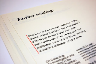
Final publication
Print specifications://
Dimensions: 570mm x 400mm
22 pages + front & back covers
Stock: Bulky Newsprint
Colour 01: Pantone Black U
Colour 02: Pantone Warm Red U

I'm pretty satisfied with the final outcome of the publication. After so many attempts to print it, refine, develop and re-print, I've finally got a complete publication printed! The stock really work's well with the spacious layout and all the time spend experimenting and tweaking seems to have paid off. The only thing that I'd still like to do would be to print out the other 11 proposed covers on the correct stock, I think this would complete the set and would really sum up the idea and direction I've been aiming for with this brief.

Website development 02://

Experimenting with different layouts. I worked with a range of different grid specifications, trying to meet the needs of an interactive website while still maintaining a consistent design direction that resembles certain elements of the publication itself.

NOTE:
Not too sure why, but when uploaded to ISSUU, the highlight boxes at the back of the larger text turns into rounded shapes instead of rectangles.

Website development 01://

First visual development of the proposed website. I won't actually be creating this website, but planning on developing the design direction and how it will function.After looking at existing websites of both paid and free publications and projects, I got a rough idea of how common websites of this use are designed. Similar to books and editorial design, websites are often designed with some form of a grid in mind to help separate out the information, whether it's text or images. The main emphasis of the website is to promote Thought Publications through an online presence, while using it as a platform to provide detailed information about the project, distributions locations, back issues and information for future issues. With this in mind, I've kept the layout quite simple, working on an 8 column grid to help divide up the different parts of the information.

My initial plan was to use the same typefaces as I did with the printed publication, but taken into consideration that it will be read on screen and mobile devices, I needed to increase point size immediately. My first development of this, was based on a newsletter format, with the title and main links at the top, and 3 columns of text following below. Although I've used an 8 column grid, I decided to utilise 2 of them to create some white space of both sides of the site, I didn't want to have 4 blocks of text as this would be too crowded, stretching the columns was also result to it being too much to read so the white space would intended to free up and offer a more relaxed look to the site.

In terms of colour, I've kept it quite simple, only using black and a few Pantone colours taken from the set of publications. For a first development, I'm quite pleased with this, although I am aware that there are plenty of things I could improve on, from here I think I'll just need to explore with a range of layouts first before deciding on a final one.

Sunday 23 May 2010

Mock up 03://

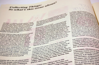
3rd mock up printed out of the publication in full scale bulky newsprint.  This was the first duplex print so far but turned out reasonably well. Although the ink does seem to be visible on the opposite side of the sheet, this was almost the quality that I wanted to achieve in the first place. It wasn't intended to be an expensive publication, so this gives it quite a nice rustic/newspaper quality to it.

Although there was a few errors with the printing, one of it being the missing font and printing symbols out for certain spreads, the overall outcome turned quite really well. The finished size of the publication works really well with the oversized scale of the publication.

This was originally going to be the final publication, but after printing it out and proofing it, there's some major areas that I really wanted to improve on, mainly to do with the type and layout of 1 or 2 spreads. A few images didn't print out very well either, so this would need to be changed. Overall, i'm pretty pleased with the outcome of this, although there are a few mistakes, I'm glad I've spotted them now than later. Planning to re-print in the next couple of days along with the promotional posters.


Friday 21 May 2010

Promotional Poster Development://

Following on from the design direction of the publication, I started developed more visuals for the promotional posters. These will be used to advertise the publication's issue dates, raise awareness of the project, offer an idea of what it's about and display the details of website and destinations of distribution. The main priority with the design was that it needed to stand out, needs to be visually appealing while still being easy to read from a distance. Similar to the front covers, I kept the layout relatively clear and consistent, working on a 9 column grid with 2 colours; the black, orange for issue 01 and the stock colour.


Final Covers - Range://

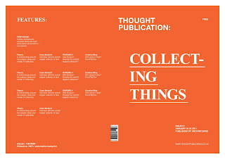
Final 12 front and back covers of the publications. Each issue is directed by it's own colour, with the image inside being produced in the same monotone colour. I've made quite a few minor tweaks mainly with the layout and type in the design, but have finally refined and finalised a set of 12 designs that will be printed on a 562mmx395mm sheet of bulky newsprint

Wednesday 19 May 2010

Cover Design Development 02://

Went back and reworked on the more detailed areas of the front covers. I needed to come up with a consistent layout that can be used throughout the range of 12 publications, so wanted to keep it type based with plenty of empty space. With the first design, I focused more on the hierarchy of each component, using only white text and exploring the layout with a 9 column grid as it allowed me to work with 2 column and 3 column text boxes.

With the second development, I introduced the use of black to compliment with the white and the orange, this allowed me to work with slightly more complicated layouts while still sustaining the sense of hierarchy of reading order. I developed the Thought Publication logo, adjusting minor leading, weight, point sizes and kerning and making it black. I've deliberately kept the logo aligned to the left, apart from everything else, as it's the publication identity, and therefore wanted to keep this separate. After printing this out in full scale, the point size for the text was too big and drew attention away from the title and also cluttered thee front page. Some of the alignments were slightly out aswell, not corresponding to anything else on the page.

For the final development, I reworked on the 'Collecting Things' title, I've kept the hyphenation as I wanted it to be read 'Collect Things' aswell as 'Collecting Things' Because I've applied the issue number at the back in black, I increased the point size of the title just to emphasise it's focus. As for the poor alignment of the text at the bottom, I decided on 4 columns for the text, aligning with the main title, and the barcode which is situated on the spine of the publication. I placed it in that position as I wanted it to be part of the design of the front and back. This also makes it easier for it to be scanned as it can be seen from both the back and front of the publication..... OH WAIT.... It's a free publication, so does it need a barcode??? Maybe not! Anyway, with the rest of the design, I've added the issue number '01/12' just to clarify the issue number. With the back cover, I've simplified the layout, working on a 2 column grid for the text, but both aligned to elements in the front cover.


What needs doing://

With a personal deadline to get this printed by the weekend so I can focus on the design boards during the last week. I need to be clear on what needs to be completed, so...

Finished spreads
Make sure images are all high res TIFF monotone
Spell check all text
Reference what needs to be referenced
Make sure all pages are numbered
Cover design is refined with correct titles and details

Range
Develop and print out the proposed 11 covers

Poster
Develop and print out on A1 or A2

Website
Develop visual mockups for website

Promotional Poster Ideas://

Initial ideas and visuals for the promotional posters.

Monday 17 May 2010

Spreads development 02://

After printing out the mockup the other day, there were clear areas that I should definitely alter and parts that I could improve and develop further on. I reworked on a few key spreads, mainly the case studies, as these would vary in terms of the amount of text and the number of images that I would plan to use in each spread. I've also taken more consideration with the use of type, columns, hierarchy and fonts choices, I'm at the point where I feel that I've almost got a good set of layouts so just experimenting and tweaking small details and playing around with different variations.

Friday 14 May 2010

Printed layout sheets://

Print outs of spreads in full scale. I wanted a proof of all my developed layouts first before I even consider taking it for final prints. As the intended size of print would be on 562mmx395mm bulky newsprint, the contrast when viewing from screen and print is completely different, therefore I really needed to get something printed for spell checks and final proofing of layouts and minor details that might not have been noticed on screen. Also, I needed to check with the printed quality of the images, if these were not up to scratch, then a re shoot will have to be arranged.

Thursday 13 May 2010

Mock up 02://

Mock up of covers and a the intro/contents spread printed on the heavier weighted newsprint in full scale. Before finalising on a grid system and typefaces/colours, I wanted to get a copy printed out first as a proof, checking all the above. The colours came out pretty well, and the text was legible, even for the inverted type at the back cover. From this, I can safely say that the the block of type could be reduced by another 1.5pt in size. I've worked on the logo of 'Thought Magazine' in a lot more depth this time, making sure the balance of each letter and as a whole is even, while considering hierarchy and the general impression that you get from it. Other than that, I'm quite pleased with the result, the colours definitely sit better on an off white stock, which was what I was aiming for. The newsprint worked well with picking up small type, it's good to fold into a publication but also thick enough for the ink to sit comfortably on it rather than being soaked in.

I haven't completely decided on which cover I would use for all the issues, so this is something I need to develop on. I'm 90% sure with the stock now, only need to test a duplex print on it to make sure that the quality doesn't get affected too much.

Crit feedback://

Got some positive and useful feedback from the crits, main points raised was that:

- I really needed to get the research for the content together so I can start forming the contents properly rather than guessing how many words I would get from it.

- I should consider the choice of typefaces more for the covers, maybe experiment and even create my own.

- Decide on the imagery that I'll be using, if they're photographs, then take pictures of them so i know what I'm working with when experimenting with layouts.

- Should the typefaces for each issue cover be the same or different towards what they're about?

From this, I have planned to rework on the covers and get more mock ups printed out. In terms of the typeface for the covers, I plan to develop a few with different fonts and specifications, but whatever I decide on will run across all 12 issues to give a sense of consistent design direction. From the crits, people were quite unsure about what the contents would be, so maybe I need to clarify this a bit more either on my blog or on the brief itself, either way I definitely need to get the research together now, as it's the only thing that my piece is missing at the moment. For the imagery, I have decided to use photography to visualise people's collections, I wanted a good balance between text and image, with them both complimenting each other in the layouts so didn't want to go into the route of illustration. As the whole booklet will be printed on 2 colours, I'm thinking of making the images monotone to the colour of that specific issue.

With just over 2 weeks left until the final deadline of this, I've planned to aim and get the finals printed next week, meaning that I'll have 6 days to get everything tested out and ready to print on thursday. So within this time scale, I need to:

- Gather research content
- Get all the spreads designed
- Gather and prepare all the images for placing into layouts
- Work on poster design as promotional material
- Work on website proposal / visualise
- Print out all 11 covers and put the final publication together.

Mock up 01://

First printed mockups at half the scale and on a standard stock, simply wanted to see what it would look like printed out and for explaining them working as a set for the crit.

Case Studies questions://

The questions that I used to gather the content for the case study of my publication. These were sent out to 6 individuals who had a unique collection of things. From this I hope to gather enough content information to fill the publication with. These should compliment the range of other contents that I will be putting into the publication.
 -----------------------------------------------------------------------------------------------
01. Name:

02. Age:

03. Occupation:

04. Home town:

05. Current City:

06. What do you collect?

07. How big is your collection?

08. What’s your reason for this collection?

09. What do you like/enjoy about your collection?

10. What got you started?

11. When did your collection start?

12. What do you do and where do you go to build up your collection?

13. What do you do with your collection? (eg: wear it, organise it, clean it, display it, sell it…..)

14. What have you got planned with your collection in the next few years?

15. What else would you like to collect? (if time, money or difficulty sourcing them wouldn’t be an issue)

16. What’s preventing you from collecting this?

17. What advice do you have for people who are thinking about collecting?

Spreads Development://

Development of some of the spreads, I used Lorem Ipsum as the default text as I'm still in the process of gathering the content information, therefore I've used this to specify the number of words I'm expecting. I focused mainly on the intro and contents page first, testing point sizes, alignments and grid specifications before moving onto other spreads. Each publication will be printed with black and a second colour + stock (each issue with it's own second colour), therefore the images will be monotoned to either black or to the second colour, which in this case is Pantone Red 032 U. For the development, I have used a selection of randomly selected images to demonstrate and experiment simply with the layout. 


Tuesday 11 May 2010

Cover Design Development://

Development of front cover designs, these are displayed as spreads; front and back which will be printed digitally on a sheet of A2 double coated newsprint and folded in half for form the publication. Altogether, each publication will consist of 6 A2 sheets folded in half, which gives me 16 pages + the front and back covers of the publications.

As documented, I have experimented with the use of type, hierarchy, layout, colour and applying the designs into a range of publications as I am only producing the 1st issue but proposal the remaining 11. I intend to make a decision on a specific layout after the crit tomorrow, which I will further develop and use as the basis of all the publication cover designs so there is a consistent design direction throughout. The difference in them being, the 2nd colour that I will also need to decide on for each issue.

Layout/Grid System://

Testing a range of different grid specifications for the spread layouts. Wasn't entirely sure whether to have an even or odd number odd number of columns to start with; each had their own benefits but just wanted to identify which would be most suitable for my publications. I have experimented with 4,5,8 and 9 column grids with a range of different row guides. I intend to transfer these digitally for a more accurate representation and to see how many words I'll be looking to fit on each spread.