Showing posts with label Brief 03. Show all posts
Showing posts with label Brief 03. Show all posts
Tuesday, 14 December 2010
Monday, 15 November 2010
Final design outcomes
Final range of printed outcomes, including an exhibition guide, post exhibition publication proposal and design direction and a set of promotional posters. Along with these are also a set of exhibition invites and a proposed website direction.

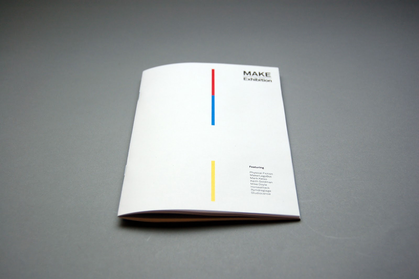
Exhibition guide - a small booklet containing information on the exhibitors, a selection of images on there work and background details.


Post exhibition publication - Publication that documents the creations visitors have made out of a limited number of LEGO bricks during there visit to the MAKE exhibition. This concept explores the idea of having an endless possibility even when people were only given the same limited selection of LEGO bricks. This is my proposal for the design direction for the publication as the event's not actually happening, Each publication contains 20 spreads made up of 10 sheets of 140gsm stock inside, all wrapped up in a gloss cover and bound together. The use of the glossy stock was intended to resemble the varnished quality of LEGO bricks, a set of 4 publications were made with the same content, it utilises the same swatch colours that was used throughout the entire range to help sustain the consistent design direction throughout.


Promotional posters printed half the scale on 140gsm stock.

Sunday, 14 November 2010
Proposed website
Website proposal and design direction for a the MAKE Exhibition. This will predominantly be used to tie everything together from the exhibition. Showcasing the ongoing collection of LEGO creations people have made from the exhibition aswell as providing the latest information and updates on where the exhibition will be travelling to next.
The layout design of the website is quite simple, working on mainly 2 columns, with the images on the left and accompanying text next to each throughout the whole website. Blue has been used throughout, ranging from the colour of the images and the lines that run across the site.
I think it works quite well, the design is simple and direct while providing a platform for people to find out more information about the exhibition.


Saturday, 13 November 2010
Revised / Final LEGO posters
Final developments of the posters. After numerous experimentations on the layouts I have decided to use a fixed format for the range of 4 posters, I think this format allows enough flexibility for the text to sit comfortably into, while having a refined order of hierarchy. All the images are centred and conform to a 3 column grid, which makes it quite spacious while sustaining an relatively ordered fashion.
Another variation of the posters, all I've done is changed the images to monotone images of the LEGO colours that Ive used throughout the booklet and exhibition guides. I think this ties the outcomes together a lot better, but I do still prefer the overall look of the full colour images.
Another variation of the posters, all I've done is changed the images to monotone images of the LEGO colours that Ive used throughout the booklet and exhibition guides. I think this ties the outcomes together a lot better, but I do still prefer the overall look of the full colour images.
Revised booklet - Cover
Made a few changes and developed a more minimal approach to the front cover. I wasn't entirely sure with the previous design of it as I felt that it didn't really fit the posters as well. With this one, I focused more on the distinctive colours of the LEGO bricks as the main design, which would continue throughout the spreads inside via coloured inserts. As a cover I do quite like it being quite subtle, it's more type driven and I think would work better with the range of materials that I have produced.
In terms of the production side of this booklet, I'm thinking of keeping the stock inside quite simple, so possibly just sticking with the 80gsm paper, for the cover I'd like to consider using a gloss stock to relate back to the texture of LEGO pieces. I've also been thinking about incorporating some spot varnish onto the cover aswell, but this will see how the print outs go. Obviously if I print on gloss, then there's no point in doing a spot varnish. However if I end up printing on a matte stock then I think the special finish would add to the quality and finish of the booklet.


In terms of the production side of this booklet, I'm thinking of keeping the stock inside quite simple, so possibly just sticking with the 80gsm paper, for the cover I'd like to consider using a gloss stock to relate back to the texture of LEGO pieces. I've also been thinking about incorporating some spot varnish onto the cover aswell, but this will see how the print outs go. Obviously if I print on gloss, then there's no point in doing a spot varnish. However if I end up printing on a matte stock then I think the special finish would add to the quality and finish of the booklet.


Revised set of promotional posters 01
Development of the posters, from the previous posters I found that it the type on it wasn't too engaging, it was simply stating the exhibition details which seemed a bit bland. Therefore wrote out a series of potential statements that I could use as the main text on the posters. I wanted something that would be engaging, that questions or makes the viewers think. The advantage of the subject of LEGO is that majority of the people have played with it and was a big part of their childhood, so most of these statements play around with reminding them of their childhood and relating to them this way.
With the other developments, I wanted them to relate back to the other range of design outcomes, so used the photos that I had collected of things people have made with LEGO as the main design direction. I wanted the posters to be informative while reflecting a flavour of what the exhibition will be about, and think this would be a suitable way of doing it.
With the other developments, I wanted them to relate back to the other range of design outcomes, so used the photos that I had collected of things people have made with LEGO as the main design direction. I wanted the posters to be informative while reflecting a flavour of what the exhibition will be about, and think this would be a suitable way of doing it.
Friday, 12 November 2010
Content Photos
As part of the proposed exhibition, visitors would be give the chance to participant and build something out of a limited amount of LEGO, these would come together and become the content for a publication that would round off the series of exhibitions. I wanted the posters to reflect the idea of creativity and the vast amount of ideas and things people can make with the same limited number of LEGO bricks,
Exhibition booklet mockup 02
Further development of the booklet - developed the front cover with a few minor adjustments, mainly with the alignments of the images and the type/layout. I decided to print these out in full colour, with a set of 4 different cover designs, that would each capitalise on a specific colour that associates to the LEGO bricks.


Developments for the front covers - experimented with a few minor adjustments, one of them was the variation of the LOGO being black/white or inverted etc.


A copy of each cover, each has the same cover but different colour variations based on the LEGO brick colours. I think they work really well together, the layout of the text seems to work well and I like the logo that's formed out of LEGO bricks, however I think I could push this a bit more and make individual designs for each colour instead of having the same one.
In terms of the stock, I really want to experiment with something that resenbles the plastic / tactile quality of LEGO bricks, so might venture into printing on acrylic or gloss stock.


Exhibition booklet mockup 01
First mock up of the exhibition poster printed out on standard 80gsm stock in black & white. The size of the booklet is 120mm x 190mm with 6 pages stapled together to form the bind. I think the size and the feel of the booklet works rather well as an exhibition booklet, it's big enough to feel 'weighty' while providing a blank canvas to display the featured work while also being an appealingly pocket - able format.
The main purpose of this print out was to develop my initial ideas for it, and to get a clear visual direction of it so far for myself and the crit. So far, I really like the format of the designs, even in black & white, they look quite suitable for the target audience and as an exhibition booklet for MAKE Exhibition.
I developed and printed two variations of the booklet so far, one with the copy laid out within the spreads, and one just utilising the spreads as a space to display the work, while an insert is bound into it that carries the copy instead. This was a direction I wanted to take but wasn't sure whether it worked or was viable so managed to get this produced aswell to see which worked better.

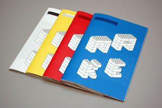
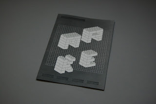
The front cover of the booklet was constructed out of vector drawn LEGO bricks that form the word MAKE, accompanied by a few details of the booklet. I wanted the cover to represent the exhibition aswell as the breadth of creative material on show. I wasn't sure whether to use photos of the work instead, but decided on creating the name out of LEGO bricks instead as it feels a bit more refined, while also keeping the content inside a bit more a surprise for the visitors.


Each spread would be dedicated to a single individual/creative, keeping the layout quite simple throughout and allowing the images to engage with the reader.


The second development incorporates the insert feature, all the copy will be printed onto the insert which gets bound into the book. This gives offers more freedom for the images and makes it a bit more interesting to read. I do like this feature, but still unsure about how I could really make it work. At the moment, it just seems to be an insert for the sake of being an insert, I need to play around with the layout, and the relationship between the content in the spreads and the inserts.

The main purpose of this print out was to develop my initial ideas for it, and to get a clear visual direction of it so far for myself and the crit. So far, I really like the format of the designs, even in black & white, they look quite suitable for the target audience and as an exhibition booklet for MAKE Exhibition.
I developed and printed two variations of the booklet so far, one with the copy laid out within the spreads, and one just utilising the spreads as a space to display the work, while an insert is bound into it that carries the copy instead. This was a direction I wanted to take but wasn't sure whether it worked or was viable so managed to get this produced aswell to see which worked better.

The front cover of the booklet was constructed out of vector drawn LEGO bricks that form the word MAKE, accompanied by a few details of the booklet. I wanted the cover to represent the exhibition aswell as the breadth of creative material on show. I wasn't sure whether to use photos of the work instead, but decided on creating the name out of LEGO bricks instead as it feels a bit more refined, while also keeping the content inside a bit more a surprise for the visitors.


Each spread would be dedicated to a single individual/creative, keeping the layout quite simple throughout and allowing the images to engage with the reader.


The second development incorporates the insert feature, all the copy will be printed onto the insert which gets bound into the book. This gives offers more freedom for the images and makes it a bit more interesting to read. I do like this feature, but still unsure about how I could really make it work. At the moment, it just seems to be an insert for the sake of being an insert, I need to play around with the layout, and the relationship between the content in the spreads and the inserts.

Thursday, 11 November 2010
Post Crit
The feedback received from today's crit varied quite a lot with several different points being raised. I ended up taking the LCA Catalogue brief to it again, eventhough I haven't been working on it since the last crit, I did this because I wanted feedback on the design direction, which I would consider when revising this later on. Majority of the people felt that the direction was decent and fits the target audience. The information is clear and layout seems consistent, therefore I should just move on with the briefs. In response to this, I think that it's fair to say that I should move on to new briefs now, but as a potential portfolio piece, I did really want to get it completed to the professional standard that I had initially aimed for, therefore I'll plan to spend no more than a weekend on revising and getting it produced. I think the main issues would be to get the rest of the products drawn out and information all typed out properly. Printing wise, it'll be quite easy as it doesn't require any particular print method of special finishes.
As for the Leeds College of Art Newsletter, I had revised this since the crit and the feedback in general seemed quite positive. The stock choice was well received the the overall change in design direction seems to be working quite nicely. I consider this brief finished now but took it to the crit as I will be taking it for a final print soon so wanted to know if there 's any minor issues that needs attention.
For the most recent LEGO brief, I took a series of invite mock ups, a couple of exhibition booklets and several A2 printed event posters. As mentioned previously, I didn't really think the invites were worth working on as I didn't see the purpose of them anymore, however as a portfolio piece, everyone else said that it would be nice to see me develop it into a range, especially as I have developed some nice visuals on it already - so something to think about really. As for the posters, booklet and general design direction I didn't really get an obvious answer to which one works best, different groups picked different directions so I have concluded that I should experiment with either merging the two or try applying them to a range of different materials. Finally the booklet; there was a strong sense that every preferred the mock up that had inserts in them, but suggested that I should use colours that were relevant to the LEGO pieces instead; something that I have considered myself already so will put this into practice for the next mock ups.
In general the feedback received from the crit was quite positive with some constructive feedback and suggestions for me to continue working from. I feel that I'm working and doing work that I enjoy, but still struggling to round things off, which means that I'm falling behind with the project management side of things. From here, I'm aiming to complete the LEGO brief by Tuesday and make a start on 1 relatively big brief and a competition brief which I would dedicate a week to.
Booklet Cover development
Development of front cover designs. The main concept of these were to come up with a distinctive cover that would also reflect the breadth of work that would be displayed in the exhibition. Here are the variations that I've experimented with, not quite sure whether to keep it quite simple or to apply the photos or vecored LEGO bricks into it. Another thing I also need to consider would be how well the booklet cover would go as a set of materials along with the promotional posters and the invites.
Questions for 2nd crit
1. Which design direction works best? The photos or the vector drawn ideas?
2. How well does the exhibition work, and which one should I go for? The one with inserts or text laid out?
3. How effectively do you think these posters engage with the target audience? ( LCA students )
4. I developed some initial ideas on the invites, but have pretty much decided to scrap this idea and I felt that it wasn't required for the exhibition anymore. What do you think?
5. CATALOGUE brief. This was actually my 1st brief but as it wasn't going in the direction that I wanted, I have taken a break from it and intend to spend a few days to revise and get this competed. Any suggestions on what I could consider? Personally I'm not entirely sure about how big the images are, or whether they are necessary at all, but as a design student how effective and useful would you see this catalogue?
6. NEWSETTER, this is pretty much finished but as a portfolio piece, there are a few adjustments I wanted to make before getting a final print on it, any suggestions or anything in particular that I should check or revise on?
Wednesday, 10 November 2010
Development - Exhibition Booklet 02
Again, another development of the booklet with very similar specifications, except for this one there is text within the spreads. I do quite like the layout, it's simple and allows the work to be the main focus.
Development - Exhibition Booklet 01
Early development of the exhibition booklet which would be distributed to visitors of the event. There's no text in this one as the idea would be to use inserts of different stock colours to hold the copy.
Development - Invites 02
Further development of invite ideas. I've moved on from the A4 format and have decided to work on something a little bit smaller at 100mm x 150mm. I have ideas to apply spot varnishes on top of the print to, but for the time being, I'm still trying to nail the design direction of the range of design materials I need to produce.
In terms of these invites, I think they work a lot better than the previous ones. They're alot more engaging and interesting but I'm still not sure on them. Infact, I'm questioning the need for an invite now and actually considering developing some of these invite designs to full scale promotional posters instead. Either way, I'm not really sure what direction to move on with, I'm thinking of scrapping the invites completely and move with developing the exhibition booklet, design for web and the promotional posters.
In terms of these invites, I think they work a lot better than the previous ones. They're alot more engaging and interesting but I'm still not sure on them. Infact, I'm questioning the need for an invite now and actually considering developing some of these invite designs to full scale promotional posters instead. Either way, I'm not really sure what direction to move on with, I'm thinking of scrapping the invites completely and move with developing the exhibition booklet, design for web and the promotional posters.
Development - Invites
Initial ideas for invites for the MAKE Exhibition. This was formatted to be A4, which would be folded twice and posted out to the guests. The ideas of these were aimed to resemble a letterhead, I wanted it to look quite minimal and direct, therefore kept it type only on one side, and having a subtle bit of design on the other. I didn't really want it to be too obvious therefore the only elements that would suggest a LEGO theme instantly would be the colours used, which are the ones of a classic LEGO brick.
I'm not too pleased with these really, they look too simple and almost crossing the line of becoming corporate which I don't want. I think I'm just going to move on with these and test out a different format for an invite. In terms of the content and visual appeal of these, they need to engage, and inform people of the event while carrying the creative and fun aspect of the exhibition.
I'm not too pleased with these really, they look too simple and almost crossing the line of becoming corporate which I don't want. I think I'm just going to move on with these and test out a different format for an invite. In terms of the content and visual appeal of these, they need to engage, and inform people of the event while carrying the creative and fun aspect of the exhibition.
Drawing LEGO
Redrawing some LEGO again, this time with more attention to detail, working on a grid so that everything lines up when it's put together. I need to ensure that the bricks are drawn as accurate as I can as this would make it easier for myself when it comes to constructing objects and letterforms, which I have started experimenting on already.


Development - Product . Range . Distribution
After developing a range of visuals for the 2 different design routes, I felt that I needed to revise on the concept and how it would transfer to a range of design materials. For an exhibition, I felt that I needed to develop a quick range of outcomes that I could consider using for invites, which would carry out the design direction of the promotional materials. I also needed to develop a short 8 - 12 page booklet that would hold the information about the exhibition and the biographies of the people who have created the work on show.


Tuesday, 9 November 2010
Printed out
I selected 3 designs that I felt were the strongest in terms of the execution and design direction to print out in A2. I wanted to get an idea of how these looked in the scale that they were intended to be shown in. The results are quite nice, the images worked really well and doesn't look anywhere as cluttered as it does on screen.


Subscribe to:
Comments (Atom)