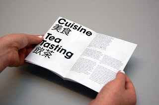
From the first spreads already, it's evident that the margins are way too small, the type's literally on the verge of falling out of the edge of the pages, which makes it quite uncomfortable to read and look at to be honest. I did want it to have a small margin but because they're so small and inconsistent now, it just looks incomplete. The type on the other hand sits quite nicely, I like the size of the columns just from looking at the overall layout but will have to get it printed out in full scale to be able to check whether it's the right specification.
The fold of the booklet seems to work quite well with this, hiding the poster content inside whilst providing enough space for a few spreads.
2nd mockup printed to scale on satin stock in full colour, it wasn't the ideal stock I wanted to print on but simply did for the sake of checking the type and size of everything in full scale. There are quite a few type asjustments that I want to make on this, mainly on the order of the type, hierarchy of things aswell as the point size and leading of the general copy. The typefaces are inconsistent aswell so will need to ensure that I double check and round things off. ITC Avante Gard will be used as the headers and type on the poster throughout, whereas Times New Roman Italic will be used across the booklet side of it to compliment the minimal approach on the rest of the booklet.
The colours of the dishes how come out nicely, maybe a bit subtle especially when viewed from a distance but I don't really think this would be an issue in this case as the idea of the poster was to inform and promote by making people intrigued, in which this feeds into. From this close up, it's pretty obvious that Futura was used, this was the initial font I tested out but as mentioned before will need to be updated.
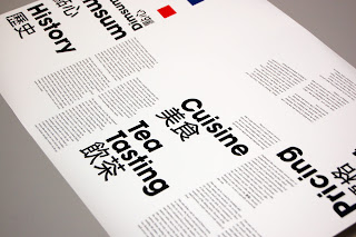
The 2nd side of the booklet before it is folded, unfortunately as it was printed on satin stock from a roll, it has been curved too much making it literally impossible to even try folding. But as a test piece, this is definitely useful for determining any further changes/ alterations on the type and layout.

It actually looks really nice when it hasn't been folded. The unusual layout really does stand out and makes you want to pick up to read. The large type does seem to work very when when it's opened out, but not quite sure about that when it's folded into a booklet. It seems a bit tight and uncomfortably especially with the tight margins. I will however need to finish off the back of the booklet aswell which I have so far left blank. I'm qite happy with the front cover, but will be using a slightly improved version for the final print tomorrow hopefully. Looking at the booklet in this form has also given me a quick idea to possibly apply a background shape, pattern or image, which get's revealed eventually when the whole thing is opened up; again another things to try out and test out later!


No comments:
Post a Comment