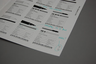
Printed a few key spreads out to scale just to check with the layout specifications gain being I start applying it for the rest of the catalogue. The direction that I've chosen is pretty simple, quite technical in terms of the information but applied in quite a minimal format, this is reflected through the use of very thin stroke weights throughout, a uniform typeface throughout, only using black & white and utilising plenty of white space and large margins.
I wanted the catalogue to be focused on the content as I feel that this is the most appropriate for the context and functional aspect of it. The only thing I struggled with deciding on was the more minor details such as the gutter and margin widths. I was still unsure about the number of columns and rows that I should use to format the catalogue so decided to print out a few and mark out issues that I need to change to help inform the final decision.
Subscribe to:
Post Comments (Atom)


No comments:
Post a Comment