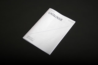
I think the general design direction is there already, I do like how bare certain pages are, which reflect the idea that it is a functional piece stripped off of all it's aesthetics. What does make the design is the considered layout, uniform spreads and the consistency throughout, which I hope is reflected well in the mock up. I'm glad that I ended up using the stapled stitch instead of the sew as it fits more effectively as a catalogue.
There are a few really minor adjustments I wanted to make, especially after getting some feedback from other people around the studio aswell as with Joe and Graham. These adjustments include minor alignments of text, spacing between the boxes and type for the front cover etc, which I am now aware of and will be making the amendments on for the final print.


Tim,
ReplyDeleteAgain some points from the crit as well as after thoughts.
Give the cover some sort of image as it just seems too dull given the image driven content.
Break up the index into separate letters to help with clarity.
Your inside and outside gutters are rather large (as you are aware from your original binding idea) so you can perhaps reduce them now and increase content size.
Me and Dave both thought you should potentially use different paper stocks throughout the publication as well in order to break up the flow of the layout.
Does this really fit into your rationale as much as your other briefs? You could do a similar brief for a client looking to sell these products to the college for example and would thus have a higher budget. i.e allow for high end print finish which you state you have an interest in.
Liam