Showing posts with label Brief 01. Show all posts
Showing posts with label Brief 01. Show all posts
Monday, 13 December 2010
Thursday, 21 October 2010
Catalogue Promotional
Development of promotional materials for the Leeds College of Art shop catalogue. I felt that the catalogue itself wasn't really enough for raising awareness of the library's stock and what was available. Now and then, I still notice 1st years struggling to find out where they could buy their materials, so decided to expand the brief a little bit by adding some additional promotional materials.
These will include promotional designs for print and digital.
These will include promotional designs for print and digital.
Wednesday, 20 October 2010
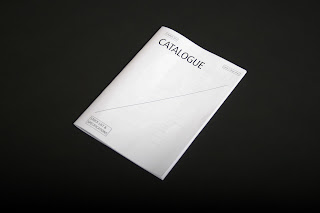
Final Catalogue
Final catalogue printed and photographed ready for the design boards.
I did end up taking a bit more time than expected to refine and get everything completed for the catalogue, there are a still spreads inside that have not been completed but I feel that what I have completed here demonstrate the design direction quite well already.


I did end up taking a bit more time than expected to refine and get everything completed for the catalogue, there are a still spreads inside that have not been completed but I feel that what I have completed here demonstrate the design direction quite well already.


Tuesday, 19 October 2010
Development 04 - Final Mockup
Final mockup of the catalogue printed on 80gsm white stock using a black & white laser printer - to scale. The specification for this is 175mm x 245mm compiled out of 20 spreads including front and back covers.
I think the general design direction is there already, I do like how bare certain pages are, which reflect the idea that it is a functional piece stripped off of all it's aesthetics. What does make the design is the considered layout, uniform spreads and the consistency throughout, which I hope is reflected well in the mock up. I'm glad that I ended up using the stapled stitch instead of the sew as it fits more effectively as a catalogue.


There are a few really minor adjustments I wanted to make, especially after getting some feedback from other people around the studio aswell as with Joe and Graham. These adjustments include minor alignments of text, spacing between the boxes and type for the front cover etc, which I am now aware of and will be making the amendments on for the final print.
Monday, 18 October 2010
Printed mockup
Printed a few key spreads out to scale just to check with the layout specifications gain being I start applying it for the rest of the catalogue. The direction that I've chosen is pretty simple, quite technical in terms of the information but applied in quite a minimal format, this is reflected through the use of very thin stroke weights throughout, a uniform typeface throughout, only using black & white and utilising plenty of white space and large margins.
I wanted the catalogue to be focused on the content as I feel that this is the most appropriate for the context and functional aspect of it. The only thing I struggled with deciding on was the more minor details such as the gutter and margin widths. I was still unsure about the number of columns and rows that I should use to format the catalogue so decided to print out a few and mark out issues that I need to change to help inform the final decision.


I wanted the catalogue to be focused on the content as I feel that this is the most appropriate for the context and functional aspect of it. The only thing I struggled with deciding on was the more minor details such as the gutter and margin widths. I was still unsure about the number of columns and rows that I should use to format the catalogue so decided to print out a few and mark out issues that I need to change to help inform the final decision.


Development 03 - Cover ideas
Development of the catalogue's front cover; working with the same typeface and experimenting with the use of colours and black & white, I developed a few initial ideas for the front cover. I've kept the design direction quite clinical aswell to keep the whole thing consistent and technical like.
Printed illustrations
Print out mocks of the illustrations and early development of the spreads to review how well they have turned out when printed. I wasn't entirely sure whether I should have continued with the illustrations; I wanted a clinical feel to the catalogue containing detailed specifications while also become functional for students of the college. One of the main issues I felt with the illustrations was that quite a lot of it seemed quite obvious, people know what a Pritt Stick looks like which pretty much eliminates the purpose of the illustrations. I felt that the balance between function and aesthetic is a key area to consider here as I didn't want the publication to simply develop into a book of images.
On the other hand, they did print out quite nicely on the black & white laser and the desired 80gsm stock, something that would be cheap to print on while being substantial enough to hold the details and be able to be binded together well. The details of the illustrations and the fine stroke weights really do add to the clinical feel of the catalogue and after printing, I feel more confident that I should simply keep the whole thing in black & white. The benefits of this would obviously be the cost for it aswell as fitting in well in context.


On the other hand, they did print out quite nicely on the black & white laser and the desired 80gsm stock, something that would be cheap to print on while being substantial enough to hold the details and be able to be binded together well. The details of the illustrations and the fine stroke weights really do add to the clinical feel of the catalogue and after printing, I feel more confident that I should simply keep the whole thing in black & white. The benefits of this would obviously be the cost for it aswell as fitting in well in context.


Development 03 - Vector drawings
Initially I was split between using actual photographs or vector drawn images to illustrated the items available from the shop as they both had unique attributes about them, I eventually decided to test out vector drawn items as I wanted an almost clinical feel to the catalogue; stripping away anything that is decorative and almost becoming over designed. I was aiming to design something that is functional but well considered with the design aspect of it, therefore opted for a series of strict guidelines for the design direction, these include: only using black on white stock (except for colour swatches), only 01 typeface throughout, fixed format and page number to be no more than 36 pages including front and back covers.
Going back to the vectored drawings, I started by taking photos of almost every single item from the shop, I decided to shoot these from a direct/ flat on angle so that all my drawings would be 2D and not isometrical or anything, therefore hopefully they won't interfere or make it too difficult to lay out with text.
A selection of the photos


When drawing these items out, I used the photos as a guide but didn't trace directly as I almost want them to look like technical drawings of the items so that it follows the technical aspect of it. To ensure that everything was consistent, I used 0.5 point stroke weights for all illustrations. One of the main problems I had which raised a few questions was how much detail I wanted to draw, particularly with packaged products such as a spray mount can or a Pritt Stick; at first I started drawing the stationary as it seemed feasible to illustrate the tips of the pens, however when it got to things like Pritt Sticks, I was almost questioning why I was drawing them and what direction it was leading.
Either way, I wasn't too sure about the direction I was working on but the initial plan for this brief was to keep it short and productive, therefore I just worked on it and hoped that the design process itself would inform my next step. I continued drawing more items following the list of items from the shop, until I felt that I had enough to start experimenting with a series of spreads.

Development 02 - Layout
Development of layouts for the catalogue; from the previous post I spent most the time trying to develop a structure for laying out the information for the equipment, focusing on the margins, gutter and type specifications. I used the pens initially to visualise this as they have the most information for them, with these I've tried to refine the arrangement of the text, images and overall layout of the spreads, while introducing smaller details such as the location of the titles, page numbers and the colour swatches for each pen.
Binding Method
Initially, I wanted to bind the catalogue by sewing a single thread through, giving it a nice tactile finish to the catalogue. I needed to test it out to see how the pages would attach and how accurate the bind would be.
I tested out booklets, each with increasing number of spreads to test the amount of paper the bind could handle ranging from 8, 10 and 12 sheets.


Saddle stitch with staple; I found that although I did like the stitch with thread, I didn't really fit well in context of the library shop. Instead I binded another book of 10 sheets of paper with a stapler, which delivers the same results but with more subtlety, something that seems to work better in relation to the context of the catalogue.

Monday, 11 October 2010
Development 01 - Layout/size/specification
Spread development for the catalogue design. Developing from the initial layout ideas I had drawn, I have started to interpret these digitally, focusing more on the essential details such as margin widths, type orientation, column and gutter specifications etc which is more efficient when working on it digitally as opposed to hand drawing them all. I think my thought process can be identified quite clearly in these, with the first one being quite bold and simple, I experimented with different variations while considering the readability, functional aspect and overal tone and aesthetics of the catalogue that I want to deliver it as.
So far I have just worked mainly on the pens & markers section, using a few initial vector drawings to illustrate my ideas. At this stage, I think i will be going ahead with the vector drawn approach for the products and have a final index at the back. As it's quite a short brief (2 weeks) and I'm already onto my second, I really need to start making some decisions on the design direction and work on the rest of the catalogue's content.
Breaking these up into different sections, these are the things I still need to do to meet my print deadline on friday:
- Type out all the information including ref numbers, normal prices & discount prices etc
- Photograph and draw out all the stationary and document all the colours available
- Collect all stock
- Decide on the size of catalogue
- Decide on final fonts specifications for the whole catalogue
- Make a decision on the stock to print catalogue on
- Decide on the binding format
- Finish all spreads
- Develop front cover
Layout development
A set of initial layout drafts that explore the range of layout possibilities, working on several different grid specifications.


Sunday, 10 October 2010
Initial Ideas
The brief was quite straightforward really as the target audience, content and subject matter's already been defined, so it was just a matter of exploring a range of possible design directions for the catalogue.


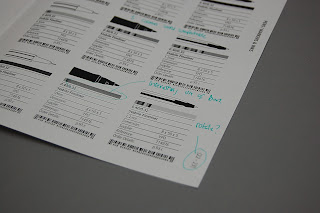
Catalogue information
The current shop leaflet; essentially this is what I will be redesign but delivering the information in a more functioning and informative way, especially for items that were quite specific such as fine liners or certain pain brushes. I found the information quite easy to navigate, but quite often wanted to know more about the items, especially when viewing these away from the shop such as in the studio or at home.


Before getting into the design process to much, I wanted to get a better idea of how much information I'll be working with, and fortunately managed to obtain the spreadsheet of the stock lists and the details of it.


Before getting into the design process to much, I wanted to get a better idea of how much information I'll be working with, and fortunately managed to obtain the spreadsheet of the stock lists and the details of it.


Subscribe to:
Comments (Atom)