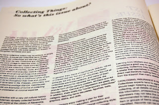
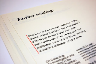
Although there was a few errors with the printing, one of it being the missing font and printing symbols out for certain spreads, the overall outcome turned quite really well. The finished size of the publication works really well with the oversized scale of the publication.
This was originally going to be the final publication, but after printing it out and proofing it, there's some major areas that I really wanted to improve on, mainly to do with the type and layout of 1 or 2 spreads. A few images didn't print out very well either, so this would need to be changed. Overall, i'm pretty pleased with the outcome of this, although there are a few mistakes, I'm glad I've spotted them now than later. Planning to re-print in the next couple of days along with the promotional posters.


No comments:
Post a Comment