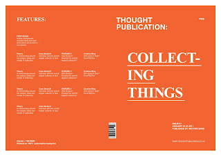
Went back and reworked on the more detailed areas of the front covers. I needed to come up with a consistent layout that can be used throughout the range of 12 publications, so wanted to keep it type based with plenty of empty space. With the first design, I focused more on the hierarchy of each component, using only white text and exploring the layout with a 9 column grid as it allowed me to work with 2 column and 3 column text boxes.
With the second development, I introduced the use of black to compliment with the white and the orange, this allowed me to work with slightly more complicated layouts while still sustaining the sense of hierarchy of reading order. I developed the Thought Publication logo, adjusting minor leading, weight, point sizes and kerning and making it black. I've deliberately kept the logo aligned to the left, apart from everything else, as it's the publication identity, and therefore wanted to keep this separate. After printing this out in full scale, the point size for the text was too big and drew attention away from the title and also cluttered thee front page. Some of the alignments were slightly out aswell, not corresponding to anything else on the page.
For the final development, I reworked on the 'Collecting Things' title, I've kept the hyphenation as I wanted it to be read 'Collect Things' aswell as 'Collecting Things' Because I've applied the issue number at the back in black, I increased the point size of the title just to emphasise it's focus. As for the poor alignment of the text at the bottom, I decided on 4 columns for the text, aligning with the main title, and the barcode which is situated on the spine of the publication. I placed it in that position as I wanted it to be part of the design of the front and back. This also makes it easier for it to be scanned as it can be seen from both the back and front of the publication..... OH WAIT.... It's a free publication, so does it need a barcode??? Maybe not! Anyway, with the rest of the design, I've added the issue number '01/12' just to clarify the issue number. With the back cover, I've simplified the layout, working on a 2 column grid for the text, but both aligned to elements in the front cover.
Wednesday, 19 May 2010
Subscribe to:
Post Comments (Atom)


No comments:
Post a Comment