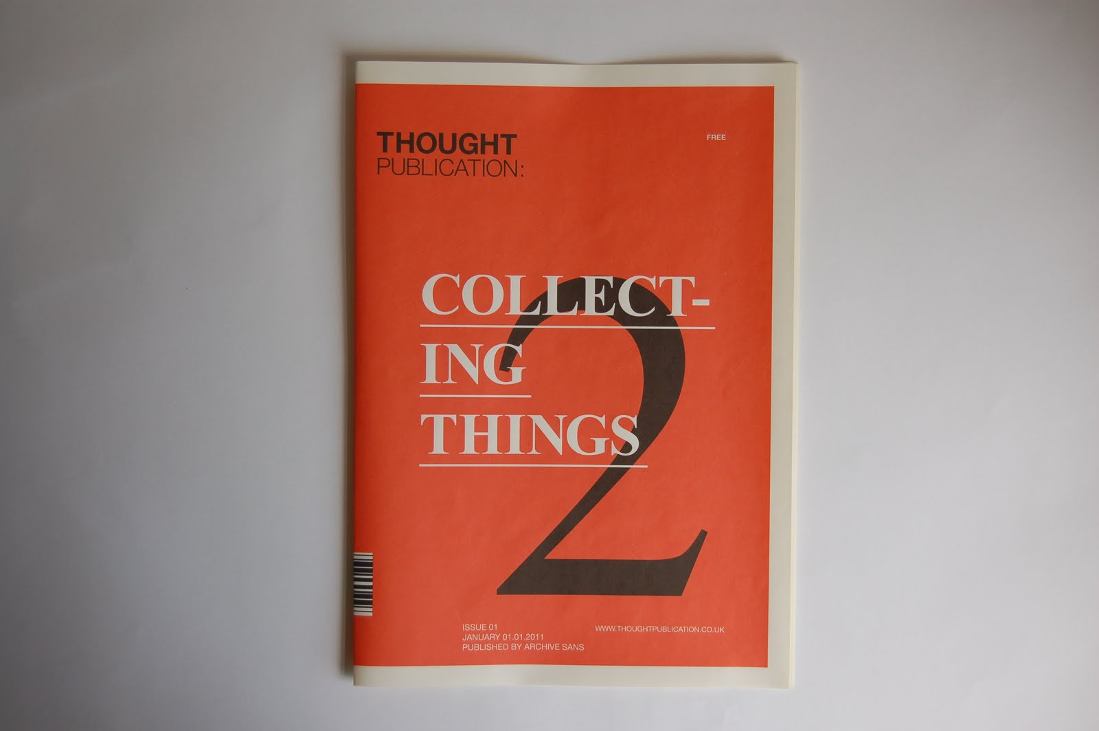
Mock up of covers and a the intro/contents spread printed on the heavier weighted newsprint in full scale. Before finalising on a grid system and typefaces/colours, I wanted to get a copy printed out first as a proof, checking all the above. The colours came out pretty well, and the text was legible, even for the inverted type at the back cover. From this, I can safely say that the the block of type could be reduced by another 1.5pt in size. I've worked on the logo of 'Thought Magazine' in a lot more depth this time, making sure the balance of each letter and as a whole is even, while considering hierarchy and the general impression that you get from it. Other than that, I'm quite pleased with the result, the colours definitely sit better on an off white stock, which was what I was aiming for. The newsprint worked well with picking up small type, it's good to fold into a publication but also thick enough for the ink to sit comfortably on it rather than being soaked in.
I haven't completely decided on which cover I would use for all the issues, so this is something I need to develop on. I'm 90% sure with the stock now, only need to test a duplex print on it to make sure that the quality doesn't get affected too much.


No comments:
Post a Comment