Showing posts with label Brief 02. Show all posts
Showing posts with label Brief 02. Show all posts
Tuesday, 14 December 2010
Saturday, 30 October 2010
LCA Newsletter Reprint - Stock consideration
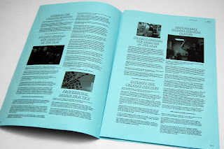
Got the newsletter reprinted today on several different stock variations, with the black & white design and Pantone blue design range. I found that the previous print outs on newsprint and sugar paper worked quite well but I wanted to move away from the budget looking newspaper feel, but instead approaching it with a more unconventional stock, to deliver a higher end, professional feel while still appealing to the younger target audience. I tested out a 180gsm blue stock, with the black & white design, I didn't think blue on blue would work so had to alter the images and formatting of it to get it printed on this stock effectively.
I think the type and layout specifications work well in this format, the overall size of the newsletter feels a lot more comfortable and more how I wanted it simply from the reduced width of it by 20mm. It definitely feels a bit more refined but I'm still not entirely sure with the direction of the spreads and how this transfers through to the front and back covers. In terms of the blue stock, I think the newsletter works really well with it, pretty amazing how much different the colour of the stock makes to a design, the folds work well and the print quality is a vast improvement from the newsprint and sugar paper. I think this overall outcome would appeal to the target audience more effectively while still carrying the information and tone of a independent art college.


Another print out but on 140gsm matte printed with the Pantone blue as the only colour used throughout. Again I wanted the feel and look of it to move away from the newspaper feel so wanted a proper white stock that would be able to hold the ink well and print the copy out precisely and clearly. The results are surprisingly pleasing; the ink sits well and the images have been printed quite nicely without bleeding through much. Unlike the coloured stock, this however does feel a little corporate for my liking, however this might be something that the college might be looking for.


A final print out, this was a combination of the newsletter printed black & white on the 140gsm matte and the 180gsm coloured stock. An experiment that merges the two tests. I think the coloured stock works well being folded within the corporate looking black & white back/front cover, making it more engaging for the viewer and utilising the stock colour to display the poster side of the design. In comparison to the white, ideally I would like to have a lighter stock, a blue that's less saturated and bit more subtle that would sit comfortably inside.


 Personally I prefer the design that's been printed entirely on the coloured stock, however I'm not sure whether I could spend a bit more time developing this or not. I definitely feel that these designs are an improvement from the previous developments, they seem more refined and carry a more design orientated tone to it.
Hopefully this will be it for this brief. Although I did end up taking over a week with the refinements and readjustments with it, I feel that it's a worthy portfolio piece that I have enjoyed working on. I'll be taking these to the tutorials with Joe and hopefully get some feedback from Graham with this, hopefully I won't have to make many adjustments with it!
I think the type and layout specifications work well in this format, the overall size of the newsletter feels a lot more comfortable and more how I wanted it simply from the reduced width of it by 20mm. It definitely feels a bit more refined but I'm still not entirely sure with the direction of the spreads and how this transfers through to the front and back covers. In terms of the blue stock, I think the newsletter works really well with it, pretty amazing how much different the colour of the stock makes to a design, the folds work well and the print quality is a vast improvement from the newsprint and sugar paper. I think this overall outcome would appeal to the target audience more effectively while still carrying the information and tone of a independent art college.


Another print out but on 140gsm matte printed with the Pantone blue as the only colour used throughout. Again I wanted the feel and look of it to move away from the newspaper feel so wanted a proper white stock that would be able to hold the ink well and print the copy out precisely and clearly. The results are surprisingly pleasing; the ink sits well and the images have been printed quite nicely without bleeding through much. Unlike the coloured stock, this however does feel a little corporate for my liking, however this might be something that the college might be looking for.


A final print out, this was a combination of the newsletter printed black & white on the 140gsm matte and the 180gsm coloured stock. An experiment that merges the two tests. I think the coloured stock works well being folded within the corporate looking black & white back/front cover, making it more engaging for the viewer and utilising the stock colour to display the poster side of the design. In comparison to the white, ideally I would like to have a lighter stock, a blue that's less saturated and bit more subtle that would sit comfortably inside.


Hopefully this will be it for this brief. Although I did end up taking over a week with the refinements and readjustments with it, I feel that it's a worthy portfolio piece that I have enjoyed working on. I'll be taking these to the tutorials with Joe and hopefully get some feedback from Graham with this, hopefully I won't have to make many adjustments with it!
Thursday, 28 October 2010
LCA Newsletter Development
Unfortunately my design for the Leeds College of Art Newsletter only made it to the 2nd round so didn't get picked to be used. Although it wasn't what they were looking for, I quite liked the concept that I had and felt that with a few adjustments it could be a worthy portfolio piece so decided to spend a day developing this and making a few improvements.
One of the issues that was raised during the crit on this was that it resembled my Thought Publication a bit, possibly due to the same stock and exactly the same size, I was aware of this when designing it but wasn't too concerned as it was intended for pitching at the time rather than portfolio. Right now, I'm thinking of changing the size of it, I want to keep the broadsheet format but maybe reducing the width of it to make it seem more academic. I also have a few ideas for the front cover that I'm intending to change now that it's not really a live brief anymore.
From my previous mockups, I had to consider the stock quite carefully due to the design requirements from the marketing team, I wanted it to look quite clinical and professional while still incorporating a tasteful design direction that would appeal to the 16+ target audience. I used newsprint to print the mock up out initially, which worked quite well. However as mentioned from my crit, people did say that it resembled the Thought Publication too much, therefore aswell as making a few adjustments to the size of the newsletter itself, I have decided to get it printed out on a white matte stock instead. I have also developed a black & white version which I intent to get printed onto a coloured stock which I think would improve the overall look and feel of the newsletter as a whole.
Test prints printed on standard 80 gsm stock in black & white. Just wanted a final check with the scale and type specifications before taking it to print for the final time.


Monday, 18 October 2010
LCA Newsletter mock up
Mockup print out of the Leeds College of Art newsletter; the idea was to actually make it in the format of a newsletter, therefore printed on newsprint with a size of just under A3, therefore when folded again it's at a decent size to post off and distribute.
Although the design's no where near completed, I just wanted to get what I had done already printed out to see what it's like in it's full scale and stock. I wasn't entirely sure with the direction so just wanted to check and get a feel of the direction it's heading so far. On a whole, the print out turned out ok, I would have preferred it if the stock worked better as this one seemed too thin for the ink to sit on properly, making some of the text difficult to read. I'm not sure on the tone of the paper either so will be testing other options soon. Also the crit's coming up so wanted to hear some feedback off people before I refine it in time for presenting it for real. From the mock up, I feel a lot more confident with the scale and format of it, the design was initially going to be an A2 folded in half to resemble a conventional newsletter format, but also printed an extra page that would slot in to illustrate how it can easily adapt to more information by adding additional pages. The design direction was quite simple; I wanted to make the logo quite prominent in the newsletter so made it the main focus with the diamond shape surrounding it to resemble an emblem shape. I used this shape as the central design direction, cropping images into diamond shapes and using diagonal lines to crop and separate text throughout. I chose to use a Pantone blue throughout, duotoning the images to keep it quite bold and also to resemble a blue print, which suggests an ongoing/ developing / unfinished copy. ( Whether or not this is good remains undecided! )
In terms of the technical specifications, I've kept it quite simple again, with the headers being Times New Roman Italic the the copy was Helvetica as required by the brief. I am unsure about the diamond shaped images but overall layout seems feasible as it gives an ordered format yet it's relatively flexible with the potential content. Overall apart from the stock, I'm pretty pleased with the outcome of this, for something that I wanted to spend half a day working on, it has almost developed into a whole brief in itself as I want to spend more time on it revising several areas and developing a further range of materials and outcomes.


Brief 03 - LCA Newsletter redesign

Subscribe to:
Posts (Atom)