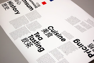
The back cover of the booklet is currently empty, as I wasn't sure whether to place the key there or as part of the poster, but after getting it printed, I think it would be suitable to get it printed on the back of the booklet as this directly links with the front cover, whilst keeping the poster side of it quite bold and data heavy.
Reworked on some more spreads development as there were some major flaws with the printed mockup no.2. Made a few adjustments with the margins in particular, which refines the overall layout when viewed at as a spreads. I found the main issue with the previous layout was that it seemed too separate from the poster side, the type was oversized, which dominated the whole page too much, so resized it. I also found that the hierarchy and reading order of the booklet wasn't efficient enough therefore made a whole change with the overall layout of the titles and copy, instead dedicating each page to a single section.
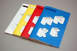
Development on the front cover
The feedback received from other people found that the front cover was too busy and was constantly drawn to the solid shapes rather than the name of the booklet. I made quite a few adjustments to the overall design for the cover, but keeping with the concept of dissecting the infographics. After developing a few variations, I've ended up going back to the origin design, but making some very subtle changes, these include making everyone on the front cover apart from the title 80% opacity, this hopefully makes the title of the booklet the main focus again as it's the only solid black. The key for the poster has been applied to the back cover, which I feel works quite well, allowing the poster side of it to be a bit more spacious and focused on the infographic diagrams.


